top of page

RESULTS

affresh appliance care

MIND'S EYE: THE GREATNESS OF GROSS

Brand Refresh and Positioning, Integrated 360º Campaign, E-commerce Redesign, Packaging Redesign, Social Media, Product Education Videos and Partnerships

The Challenge: The Invisible Culprit

The CPG cleaning category is notoriously template-driven, relying on predictable, loud formats that push product features. The risk was twofold:

  1. Client Persuasion: Convincing a major CPG client to abandon safe, proven, yet creatively bankrupt ad formulas for a silent, psychologically tense, and non-linear approach.

  2. Conceptual Challenge: Reframing a low-interest product (which people assume they don't need) into the deeply satisfying answer to a hidden, emotional problem—unseen "funk" and domestic unease.​


The Pitch & Action: Directing Disruption, Protecting the Craft

As the Group Creative Director, my primary role was two-fold: to persuade stakeholders that discomfort would drive conversion, and to direct the end-to-end craft to ensure the concept’s integrity held through production.

We built Mind’s Eye to be a "creeping realization," forcing the audience to lean in. Every creative decision was a zag against expectation, transforming a simple commercial into a cinematic mystery:

  • Selling the Silence: I successfully championed the bold decision to open each film in total silence—a calculated risk that disrupted a loud ad landscape, forcing the double-take necessary for cut-through.

  • Concept & Visual Pacing: We abandoned traditional narration, instead visualizing real, unsettling consumer fears ("Why does my dishwasher smell like fish?") as surreal, high-production vignettes. The slow, emotional build intensified the discomfort before delivering the catharsis: the single, zero-effort affresh tablet.

  • End-to-End Production: I directed the adaptation of this psychological tension across all platforms—from cinematic audio placements to "how-to" content reimagined as voyeuristically satisfying transformations, ensuring conceptual rigor at every stage.​


The ROI: Conversion Through Creative Bravery

By breaking the expected format and replacing predictability with psychological tension, Mind’s Eye became affresh’s most effective campaign to date. The strategy proved that creative risk is a viable business driver, translating psychological tension into measurable commerce:

  • +146% growth in “Buy Now” conversions

  • +187% increase in landing page views

  • +126% video engagement rate

  • +7% lift in unaided brand awareness

PAID SOCIAL – FACEBOOK – Carousel

PAID SOCIAL – PINTEREST

PAID SOCIAL – PINTEREST

INSTAGRAM – AI / VEO + PHOTOSHOP + PREMIERE

INFLUENCERS & ORGANIC POSTS

PRODUCT PHOTOGRAPHY – Lifestyle

Original Brand Photography

AMAZON STORE PAGE

PRODUCT EDUCATION – How To Video

DISHWASHER – INSTRUCTIONAL

DISHWASHER – INSTRUCTIONAL

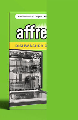
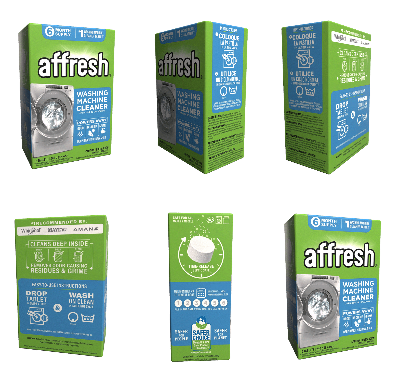
PACKAGING REDESIGN

High-Performing Designs Optimized for Site and Shelf

SITUATION
After building early momentum in a sleepy category, affresh suddenly found itself with company. Big players—Tide, Finish, Lemi Shine—entered the appliance cleaning space with deep pockets and brand recognition. We couldn’t win on media spend. But there was one battleground we could own: how the brand showed up in the scroll. Note: The packaging redesign was not asked of the agency, but something I brought to the client as a high-impact opportunity they had not considered. 

TASK
Outperform larger competitors at the digital shelf—Amazon, Lowe’s, The Home Depot—especially on mobile, where first impressions are made in half a second. Our current packaging was falling short: too cluttered, too dated, too easily ignored. The job was to redesign the packaging to stop the scroll, communicate faster, and convert better.

ACTION
We treated packaging like advertising: if it doesn’t perform, it doesn’t exist. I led the creative strategy and messaging architecture for the affresh packaging overhaul—designed specifically to excel in mobile-first, thumbnail-heavy environments.

Our design principles:

• Contrast as currency: We pushed high-contrast colors and simplified structures to maximize visibility in small format.

• Consistency with flexibility: Created a clear design system across SKUs using color-coding and iconography for fast product recognition.

• Clarity over clutter: Simplified headlines, added visual cues, and trimmed Whirlpool branding to broaden appeal beyond owned appliances.

• Confidence in form: Elevated the dissolving tablet as the visual hero—an ownable point of difference that reinforced performance.

• Modernization with intent: Retained affresh’s iconic green, but with a refined, premium tone to signal quality, not commodity.

• Every move served a dual purpose: brand integrity + conversion power.

RESULT
While full rollout data is still in progress, early signals and internal testing showed:

• Dramatic improvement in mobile legibility and click-through appeal

• Stronger visual consistency across SKUs

• Increased usage clarity for new buyers

• Reinforced affresh’s distinct visual identity in crowded brand environments

• Clear stakeholder alignment across product, retail, and eComm teams

• The packaging is now a tool, not a tag—a conversion engine designed for how people actually shop today.

REFLECTION
When your product appears in a scroll—not on a shelf—packaging becomes the point of persuasion. This redesign wasn’t cosmetic. It was commercial. Built to win in pixels, not just in hand. And designed to make affresh look like the smart choice before a customer even clicks.

Dunn Portfolio Logo

michael@dunnad.com
404-661-5458


MICHAEL DUNN
ADVERTISING CREATIVE DIRECTOR

“Fearless concepts, award-winning innovation, emotive storytelling, and a fan-first mentality that continually rewrites the marketing playbook.”

bottom of page